Box and whisker plots
Box plots are valuable way of visualizing experimental data. They can be used to present central tendency and approximation of the sample distribution.
The initial step of data analysis in any kind of experiment is the data cleaning and visualization. It is always a good approach to look at your data before you proceed to further analysis like e.g. hypthesis testing.
So, which parameters of your data should be interesting to you?
You should focus at least on:
- central tendency,
- variability (distribution),
- shape of distribution (e.g. skewness),
- outlying observations (abnormal observations).
You can analyze them by looking at descriptive statistics of your data, but as old memento says - a picture tells a thousand words...
Box-and-whisker plot
A very popular way of presenting common parameters of sample is to visualize them on so-called box-and-whisker plots (or just box plots), which were proposed by John Tukey in 1977 [1].
Box plot provides an overview of data by presenting its central tendency (Q2 - median), approximation of variable distribution shape (minimum, Q1, Q2, Q3, maximum) and outlying observations. This should be enough for the beginning...
How to read box plot
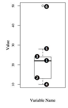
An example of a box plot is presened in a figure on the right side of the page. The most important parts of the plot are labeled with numbers:
- Horizontal line inside the "box" is 2nd quartile (Q2 - median),
- Lower border of the "box" is the lower quartile (Q1 - 25% of observations have lower value than this one),
- Upper border of the "box" is the upper quartile (Q3 - 75% of observations have higher value than this one),
- Edge of the lower whisker is the smallest, not outlying observation (value of smallest observation which lays between Q1 and Q1 - 1.5 x IQR, where IQR = Q3-Q1),
- Edge of the higher whisker is the highest, not outlying observation (value of highest observation which lays between Q3 and Q3 + 1.5 x IQR, where IQR = Q3-Q1),
- Outlying observations - those are suspicious observations you should investigate:
- mild outlier - value is between Q3 + 1.5 x IQR and Q3 + 3 x IQR, or between Q1 - 1.5 x IQR and Q1 - 3 x IQR, where IQR = Q3-Q1).
- extreme outlier - value is higher than Q3 + 3 x IQR, or lower than Q1 - 3 x IQR, where IQR = Q3-Q1).
Typical extensions to box plots
You can also find extended versions of box plots. The most typical extensions are done by adding the mean value (in most cases as a cross), or change to "box" to its "notched" version, which presents confidence interval around the median.
Box-plots in R by example
Imagine you have conducted a simple experiment in which you wanted to compare efficiency of programmers using Java and C languages. You executed the experiment, giving the same tasks to both groups of developers. Lets assume that each group consisted of 21 people. Now you would like to visualize your data...
The R statistical package [3] has built-in function for producing box plots. I will not explain all of options available ( you can find them in help to the system or at Quick-R page [4]). I will present you "my way" of generating plots in R.
Lets assume we have results of our experiments in text file "example.txt":
Java C
10 4
11 16
...
First we have to load the data to the data.frame:
input_table <- read.table("./example.txt",header=TRUE)
Then we are able to generate a box plot by calling the boxplot function. I always enclose plotting with storing graphical parameters, setting some additional parameters and restoring graphical parameters (par function) after plotting is finished:
oldpar <- par(family="serif", mai=c(0.8,0.8,0.4,0.1), omi=c(0,0,0,0), mgp=c(2,1,0))
boxplot(input_table, xlab="Time [minutes]", ylab="Programming Language",
	outline=TRUE, family="times", cex.axis=0.8, horizontal=TRUE)
par(oldpar)
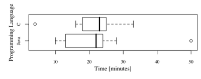
You should obtain following plot:
What would be our observations? First of all we can see that the central tendencies of both samples are nearly the same (Java - 22, C - 23). What is more both distributions are negatively skewed. There are two outlying observations, in case of Java group, one person spent 50 minutes on the task. It is good idea to talk to this person, maybe there were some problems with computer, software etc. There was also one outstanding participant in group C. This time it might be suspicious because it took only 4 minutes to complete the task (very experienced developer?)
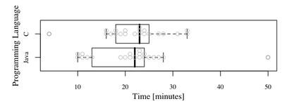
Personally, I usually combine scatter and box plots (especially where samples are small). Why? Lets see what happens when we change our code to display them both:
oldpar <- par(family="serif", mai=c(0.8,0.8,0.4,0.1), omi=c(0,0,0,0), mgp=c(2,1,0))
boxplot(input_table, xlab="Time [minutes]", ylab="Programming Language",
        outline=TRUE, family="times", cex.axis=0.8, horizontal=TRUE)
for (i in 1:dim(input_table)[2]){
    stripchart(input_table[,i], method="stack", vertical=FALSE, pch=21,
               add=TRUE, col="gray", jitter=0.4, at=i)
}
par(oldpar)
We can see now:
Can you see anything special? Look at Java group and observations with values around 10. We had observed before that distribution is negatively skewed, but you can see now that you have two separate groups of observations. The questions is why? Of course it might be "coincidence" but you should investigate it. Maybe there were two possible implementations, and one of them was significently shorter... or maybe participants of the "around 10 group" used some external library ...
Summary
That would be all concerning box plots. You can see now that they are quite powerful tool for getting the overview of your data (central tendency and shape of the sample distribution).
If you have any further questions add comment below the post or go to the forum and ask questions.


